Blog

Senior Portrait Retouching

photo_KC_0265

Kaia Calhoun shoots a lot of senior portraits. And teenagers (and their parents) have a lot of special requests: removing acne and scars, bruises from athletes’ shins, even editing out braces. Each session is different and I love the challenge!

Allen’s 70th Birthday Poster

What to get the man who has everything and is so appreciated by so many people? An artful reminder of just how much he is loved, of course! For Allen’s 70th birthday, the family commissioned me to design a simple black and white piece featuring a list of 70 things they loved about their father and grandfather.

allen_mockup

Not all projects need to be big. In fact, sometimes the smallest make the most impact. I know Allen loved his!

Pocket of Posies’ Business Cards

Last year, a pair California floral shop owners got in touch about business cards. After only a few emails back and forth, I realized they were pretty much my ideal clients—quick and decisive with feedback, open to new ideas, and maybe most importantly, they seemed to truly understand and value the work that goes into letterpress printing. Plus, they were interested in incorporating my new watercolor illustration services into their cards!

Pocket_of_Posies_6470

The result were these gorgeous bespoke cards. They were about as artisanal as you can get in an edition of several hundred: Hand-printed on an antique letterpress, hand-trimmed, and each hand-painted with a unique watercolor flower.

This year when they got in touch for a reprint, they were looking for a slightly lower cost product, so we decided to merge commercial printing with my letterpress work. Since the design on the back of the cards didn’t create a significant impression into the paper, I would have that side printed commercially, while letterpress printing the front. We decided to bring costs down even more by also commercially printing the flowers on the front, which of course isn’t as beautiful and unique as the original hand-painted work, but as a small business owner, I get it! And, since I print business cards four at a time, I was still able to incorporate different painted flowers to imbue the cards with some variation. Overall, I think they turned out great and I’m thrilled to be able to offer hybrid services to future clients!

POP_businesscards_0793

Krista & Chris’ Gorgeous Grey Wedding

krista+chris-4

Bride-to-be Krista came to me last fall with some pretty fabulous ideas for her save the date coasters. Inspired by the couple’s love of nature and subtly beer-themed big day, she wanted to focus on stylized leafy laurels. She also knew she wanted to avoid a super-swashy wedding script, opting instead for modern hand-drawn typography.

I spent some time working on each element in my sketchbook before creating vector elements from my sketches on my computer. When I started printing her coasters with sage-grey ink on my antique letterpress, I knew all that work had been worth it.

krista_processkrista+chris-2

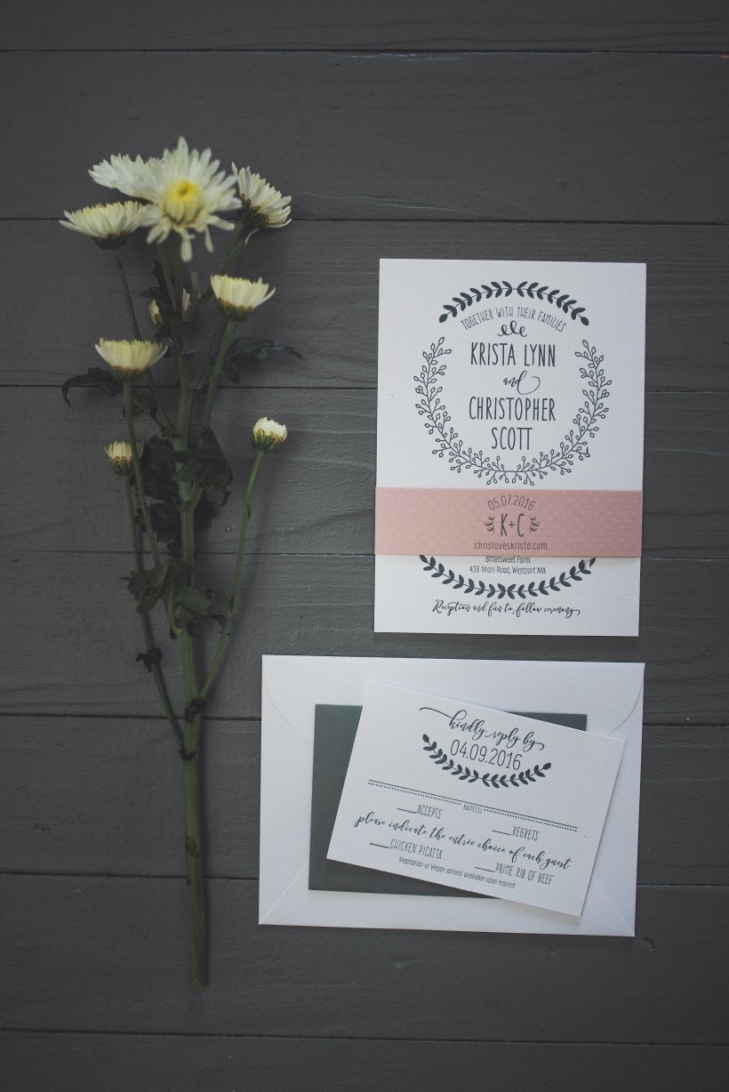
When we started talking invitations at the beginning of the year, we both wanted to keep the main design elements the same. I imbued a bit more formality into the invitations by switching out the script typeface from her save the dates for a calligraphy inspired font and lightening up the handwritten typography. I’m absolutely in love with it—especially in white ink on her envelopes!

krista_chris_0749

Just before the big day, Krista got in touch for a few more projects, including a super creative guest book idea:

“Often times at weddings we find that people write the same thing over and over again in the guest book. We wanted our guest book to be fun and interactive, and the mad libs idea was the perfect fit for this! Almost all of our guests filled it out, some people even filled out two. The best part was that no two were the same. We were able to make the guest book entertaining for people to fill out, and our guests left us some hilarious advice at the end of the mad libs as well. We plan to make a book out of all the response and leave it on our coffee table to reminisce over for years to come!”

kristachris-463

Love and laughter for years to come—I’ll cheers to that!

kristachris-423

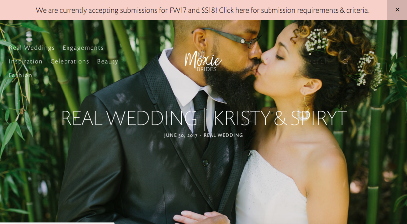
All professional photos by Sara Smile Photography

Pediatric Congenital Heart Foundation Collateral

heart_infographic.png

Did you know 40,000 children are born with heart defects every year in America? The Pediatric Congenital Heart Foundation (PCHA) works to raise awareness about the most common birth defect and provide support to parents and patients.

Although they already had a logo and style guide, they needed someone to build out their branding and create a variety of collateral. The first project we worked on was a way to explain all the facets of the work they were doing in an easy to understand, visual format for both print and digital.

After interviewing staff in person and via email, I came up with the idea of a “choose your own adventure” map that breaks down the three main facets of the organization into smaller objectives and then shows their accomplishments in each area, and how they interact to accomplish bigger goals. In addition to statistics, they also wanted to incorporate anecdotal evidence in the form of patient quotes and personal stories.

PCHA_map-1

It was a lot to include and organize, but I think this visual web is a great solution! This piece was printed as a fold-out poster and then translated into an interactive PDF as well.

Photo Editing for a Lifestyle Photographer

Emily Colbert is a Missouri-based lifestyle photographer who sends me sessions that need a bit of extra love—in the form of photoshop work.

photo_EC_MG_4626-4

The images from this sweet little newborn session were just about perfect—except for the textured background. Because of transparency of the cheesecloth, Emily just couldn’t quite fix it in a way that looked natural. Working at extreme magnification, I was able to do so and get the entire session back to her in just two days!

photo_EC_MG_8559-4

The background was the issue once again in a portrait session for a personal trainer. Emily had shot the photos with strong directional lighting to highlight the trainer’s muscle tone, but unfortunately that resulted in a muddy gray background. The client wanted a clean white background for her website but the wispy tendrils of her hair presented a challenge. Using a variety of techniques, I was able to pull the color from the background without losing her hair.

Magazine Ad Round-Up

ads_5947

Since I left BRAVA as Art Director last year, I’ve stayed on in a freelance capacity as the magazine’s ad designer. Although BRAVA encapsulates a handful of different brands and I work with a number of freelance clients as well, it’s been fun to break out of the aesthetic I’ve been working in for more than seven years—each advertisement needs to be different from the last, each time you’re working with a new set of brand guidelines and supporting materials.


Those White Walls Media Kit

THOSE-WHITE-WALLS-06

Ali is a photographer and fashion blogger who I met way back in my BRAVA days. In the last few years, her blog and social media following have taken off and Ali’s been able to capitalize on her influencer status.

To do so, she needed to package her talents and stats into an easily digestible package for advertisers and prospective clients—otherwise known as a media kit. Between the great imagery, easy stats and a clear plan, this interactive PDF was a joy to create and super functional!

We’ve since updated the kit with fresh photos and a new logo I designed, which you can read more about here.

September Fashion

Each month, BRAVA produces a fashion feature that rivals those in national publications. I often go above and beyond my regular duties of scouting and choosing the location, planning the shot list and directing the photographer, working with the models, coordinating every aspect of the shoot and designing the pages—to conceptualizing the editorial angle of the feature, helping chose the vendors and products featured, even writing a headline or two!

fashion_5937

While every September issue highlights an extra special fashion feature, this last shoot might just be my favorite ever! I secured an amazing location—the Chazen Art Museum in downtown Madison—which had luxurious but neutral textures and amazing natural light to that allowed the richly embellished garments and accessories to shine. Pair those factors with one of my favorite photographers and amazing model and we’ve got a shoot that is a perfect ending to one chapter in my career. Click here for the full feature.