Venue Sketch Save the Date Coasters

It’s been a busy year for wedding projects, which means it’s been a terrible year for posting about them! One of the most popular projects in 2018 was save the date coasters featuring a custom venue sketch. It’s so fun to look back over a few of my favorites to see how my skills have improved and aesthetic has changed over the last 12 months. For each of these projects, I hand-drew the venue and supporting illustrations, designed the coaster and hand-printed the coasters on my antique letterpress.

jessie_coasters_0120

Jessie got in touch in late 2017 about their destination wedding the following summer (smart bride!). She wanted their Belgian venue to feature prominently on both their save the date coasters and invitations, along with hops vines to give guests a head’s up about all the beer they would be drinking!

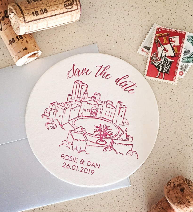
Rosie_Dan_STD_3719

Rosie and Dan are getting married in just a few months at an amazing European castle. There were so many tiny details in their magnificent venue, the challenge here was simplifying the sketch to into outlines while keeping the spirit of the castle.

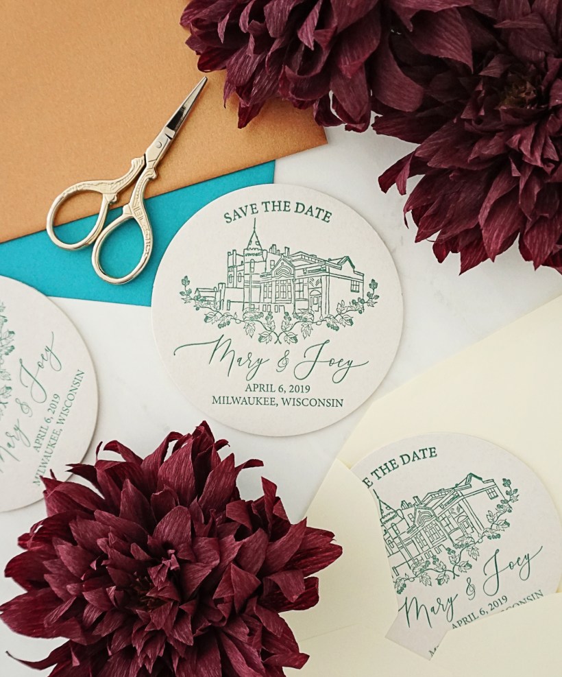
Mary_Joey_6089

Mary and Joey are getting married at Milwaukee’s historic Pabst Brewery—so of course a coaster was the perfect way to tell guests to save the date! I love that they chose such a dynamic angle for their venue sketch—not only is it fun for me to do something a little different, it shows off the unique architecture of the structure. They had seen the hops design on Jack & Jessie’s coasters and wanted to incorporate that as well. I’m also completely obsessed with the pointed pen calligraphy font I used to typeset their names!

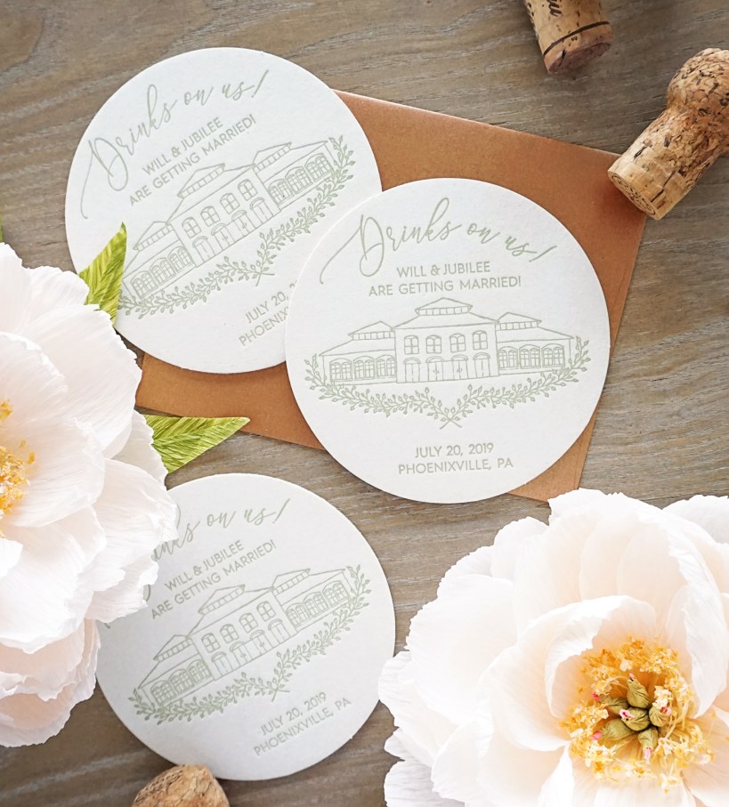
will_std_9411

And finally, I just finished printing Will & Jubilee’s festive coasters for their Pennsylvania wedding next year. They are getting hitched at the historic Phoenixville Foundry, a truly statuesque venue. Will asked if I could eliminate some of the extraneous details to focus on the building itself, to which I happily obliged!

will_std_9453

An Extra Special Watercolor Wedding Map

lucie_curtis_map_8931

Lucia and Curtis had purchased their wedding invitations from a popular website, but wanted to add a custom map to encourage their guests to explore some of their favorite places during their wedding weekend. I worked with the groom’s mom to create this special piece, featuring hand-painted watercolor illustrations of the wedding venue, his hometown and some of the spectacular natural features of the area. It is above and beyond any of the maps I’ve designed previously, but I think it was well worth the effort!

Echo the Owl

I’m so excited to finally reveal my latest project for PCHA! Earlier this year, they asked if I could come up with a child-friendly mascot for the organization—and they had settled on the idea of an owl. They wanted him to be cute and soft, restricted to just a few colors, and include the PCHA logo. I illustrated a few options, incorporating the logo of course, but also using the curves of the heart to inform the forms of the owl’s body, you’ll notice it in the beak and wings especially. After a few tweaks, we had this little guy finalized! After a contest was held to name him, I’d like to introduce: Echo!

CHA_owl_final

While he’s being used in various collateral (I even added sneakers in one iteration, so he could represent a 5k!), the most exciting version of Echo is that he now exists in 3D! A company took my illustration and brought it to life as a squishy stuffed animal. Several thousand of them have been distributed to children affected by CHD to comfort them while undergoing the barrage of surgeries and treatments that typically follow a diagnosis.

00100dPORTRAIT_00100_BURST20180523151315925_COVER

Krista & Chris’ Gorgeous Grey Wedding

krista+chris-4

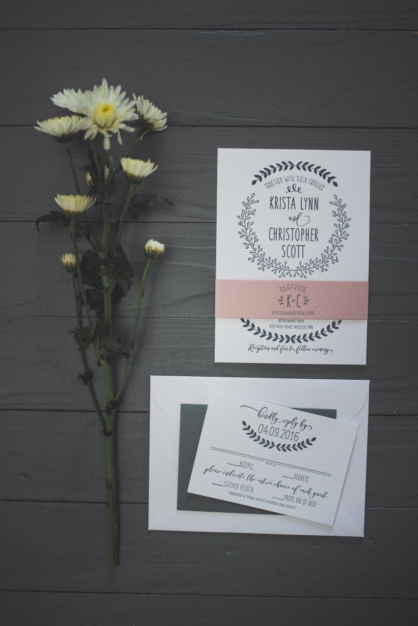
Bride-to-be Krista came to me last fall with some pretty fabulous ideas for her save the date coasters. Inspired by the couple’s love of nature and subtly beer-themed big day, she wanted to focus on stylized leafy laurels. She also knew she wanted to avoid a super-swashy wedding script, opting instead for modern hand-drawn typography.

I spent some time working on each element in my sketchbook before creating vector elements from my sketches on my computer. When I started printing her coasters with sage-grey ink on my antique letterpress, I knew all that work had been worth it.

krista_processkrista+chris-2

When we started talking invitations at the beginning of the year, we both wanted to keep the main design elements the same. I imbued a bit more formality into the invitations by switching out the script typeface from her save the dates for a calligraphy inspired font and lightening up the handwritten typography. I’m absolutely in love with it—especially in white ink on her envelopes!

krista_chris_0749

Just before the big day, Krista got in touch for a few more projects, including a super creative guest book idea:

“Often times at weddings we find that people write the same thing over and over again in the guest book. We wanted our guest book to be fun and interactive, and the mad libs idea was the perfect fit for this! Almost all of our guests filled it out, some people even filled out two. The best part was that no two were the same. We were able to make the guest book entertaining for people to fill out, and our guests left us some hilarious advice at the end of the mad libs as well. We plan to make a book out of all the response and leave it on our coffee table to reminisce over for years to come!”

kristachris-463

Love and laughter for years to come—I’ll cheers to that!

kristachris-423

All professional photos by Sara Smile Photography

Pediatric Congenital Heart Foundation Collateral

heart_infographic.png

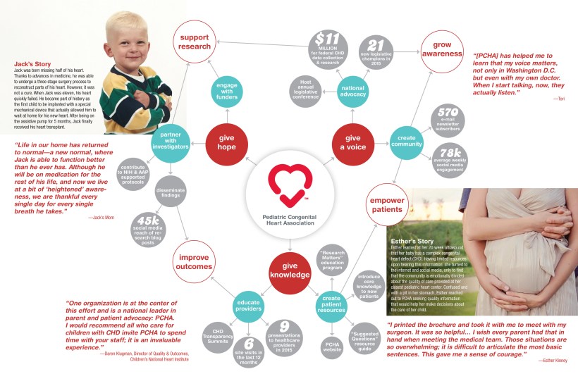
Did you know 40,000 children are born with heart defects every year in America? The Pediatric Congenital Heart Foundation (PCHA) works to raise awareness about the most common birth defect and provide support to parents and patients.

Although they already had a logo and style guide, they needed someone to build out their branding and create a variety of collateral. The first project we worked on was a way to explain all the facets of the work they were doing in an easy to understand, visual format for both print and digital.

After interviewing staff in person and via email, I came up with the idea of a “choose your own adventure” map that breaks down the three main facets of the organization into smaller objectives and then shows their accomplishments in each area, and how they interact to accomplish bigger goals. In addition to statistics, they also wanted to incorporate anecdotal evidence in the form of patient quotes and personal stories.

PCHA_map-1

It was a lot to include and organize, but I think this visual web is a great solution! This piece was printed as a fold-out poster and then translated into an interactive PDF as well.