Venue Sketch Save the Date Coasters

It’s been a busy year for wedding projects, which means it’s been a terrible year for posting about them! One of the most popular projects in 2018 was save the date coasters featuring a custom venue sketch. It’s so fun to look back over a few of my favorites to see how my skills have improved and aesthetic has changed over the last 12 months. For each of these projects, I hand-drew the venue and supporting illustrations, designed the coaster and hand-printed the coasters on my antique letterpress.

jessie_coasters_0120

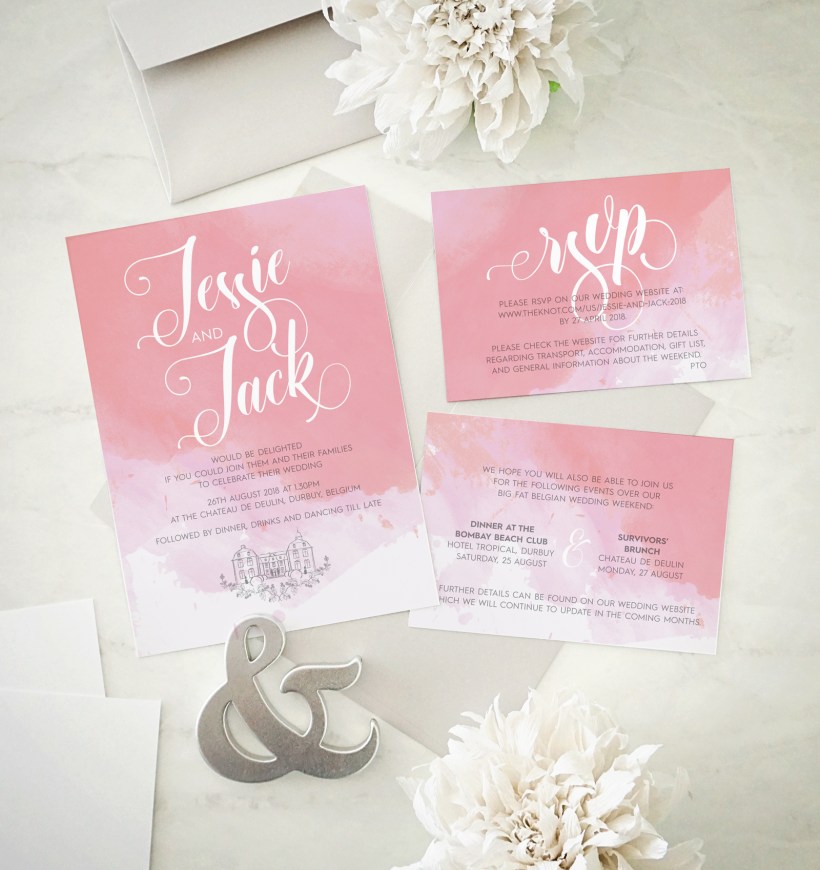
Jessie got in touch in late 2017 about their destination wedding the following summer (smart bride!). She wanted their Belgian venue to feature prominently on both their save the date coasters and invitations, along with hops vines to give guests a head’s up about all the beer they would be drinking!

Rosie_Dan_STD_3719

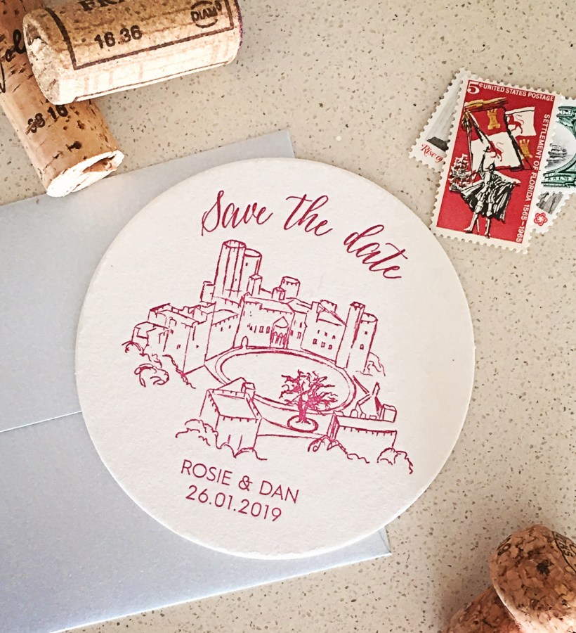
Rosie and Dan are getting married in just a few months at an amazing European castle. There were so many tiny details in their magnificent venue, the challenge here was simplifying the sketch to into outlines while keeping the spirit of the castle.

Mary_Joey_6089

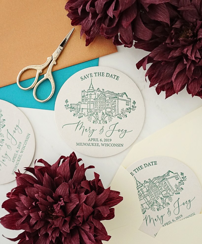
Mary and Joey are getting married at Milwaukee’s historic Pabst Brewery—so of course a coaster was the perfect way to tell guests to save the date! I love that they chose such a dynamic angle for their venue sketch—not only is it fun for me to do something a little different, it shows off the unique architecture of the structure. They had seen the hops design on Jack & Jessie’s coasters and wanted to incorporate that as well. I’m also completely obsessed with the pointed pen calligraphy font I used to typeset their names!

will_std_9411

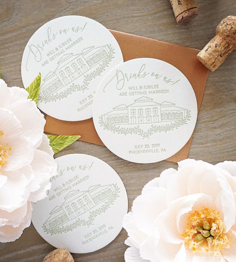
And finally, I just finished printing Will & Jubilee’s festive coasters for their Pennsylvania wedding next year. They are getting hitched at the historic Phoenixville Foundry, a truly statuesque venue. Will asked if I could eliminate some of the extraneous details to focus on the building itself, to which I happily obliged!

will_std_9453

Jessie & Jack’s Wedding Invitations

Usually when I’m designing for a client, I create a few options that are exactly what they’ve asked for, and one or two that are what I would do if given carte blanche to finish the project however I wanted. Every once in a while the client chooses my preferred design—this is one of those cases!

jessie_jack_invites_8892

I love the ethereal watercolor background, the reverse over-sized script paired with simple all-caps typography, and that we incorporated the venue sketch from their save the dates to tie the stationery suite together. They are my perfect invite!

When Pigs Fly Letterpress Business Cards

Kim has been a 622 press stockist for years, so when she decided she needed new business cards, I was honored that she reached out to me! She knew she wanted to modernize her branding while keeping the rustic charm of her logo with square cards made from kraft paper.

whenpigsfly_cards_6141

Since the business recently went to a special event/by-appointment-only structure, highlighting the contact information was vital. And because we only had two inch squares to work with, using both sides was necessary to have enough white space and include illustrated icons for emphasis.

We were going back and forth between black and white ink, but ultimately decided to go with black for increased legibility, so I inked up the press and hand-printed and trimmed several hundred cards!

whenpigsfly_cards_6155

An Extra Special Watercolor Wedding Map

lucie_curtis_map_8931

Lucia and Curtis had purchased their wedding invitations from a popular website, but wanted to add a custom map to encourage their guests to explore some of their favorite places during their wedding weekend. I worked with the groom’s mom to create this special piece, featuring hand-painted watercolor illustrations of the wedding venue, his hometown and some of the spectacular natural features of the area. It is above and beyond any of the maps I’ve designed previously, but I think it was well worth the effort!

Anne Connor Photography Squarespace Website

anneconnor_homepage

Anne Connor is a photographer, shop owner, mother, and prominent member of the community. Could she have spent a week or so figuring out how to set up her Squarespace website? Certainly. But instead she decided to save her time and energy for other pursuits and have me do the initial set up. We sat down together and I gave her a quick tutorial so she can now update the site herself!

anneconnor_portfolio

Wedding & Event Planner WordPress Website

It seems appropriate to unveil Danzante Events’ new website on Valentine’s Day! After all, it’s all about love—and I’m absolutely in love with it!

One of the things that prompted Rebecca to seek me out was her clunky old website, so we got to work on it as soon as her new logo was finalized. She already had a WordPress plan and was comfortable with the interface, so we decided to stick with her current provider, but otherwise I was starting from scratch. I found a template to work as a base, then modified and added plug-ins to create a custom site that fulfills all her needs.

danzante_homepage

Samantha & Christian’s Fabulous Foil Invitation Suite

Can I declare these my favorite invites of 2018 even though we’re barely three weeks in? The bride, Sam, described her big day as a modern but cozy event, full of white flowers, candles and grey and gold accents. They had wisely chosen a single venue for the entire schedule (it is January in Wisconsin after all!) which was a historic mansion overlooking a snow-covered lake, and Sam was going with a nontraditional wedding dress.

sam_christian_00042

I translated these ideas into both design and materials: Pointed pen calligraphy pairs with modern typography and an abstract swash element while luxurious gold foil and white ink accent textured charcoal paper and gold envelopes.

sam_christian_0048


Aroma Flow Logo Process

It’s easy to forget that some of the everyday aspects of my job are totally foreign to my clients. I recently finished up another small business branding project, so I thought I’d take you through the process!

An old coworker of mine connected me with her friend Brittney, a Montana-based yoga instructor. We scheduled a phone meeting where I learned about how she’s been incorporating essential oils into her practice and classes, and is starting a business to share her knowledge with other instructors. We talked about her audience and the feeling she wanted the logo to evoke, as well as practical parameters like the necessity of her new business branding to gel with her existing studio logo and the logo of the essential oils she uses. Brittany also wanted to incorporate the imagery of a drop somehow, and use colors that represent her audience of strong women: warm, saturated hues.

aroma_flow_logo_options.jpg

The conversation lasted less than a half hour, but since Brittany had such a clear picture of her audience and direction for her business, I also had a really good direction for the logo. I designed quite a few options and sent Brittany the best ones.

While sometimes there are a few rounds of changes, in this case, I did a few slight tweaks and the Aroma Flow logo was finished! I worked up a simple style guide to help steer future projects—often I’ll create a more comprehensive branding package with print and digital collateral, but her hubby is a designer so they were going to do that part in house (literally!).

aroma flow logo