Ali and I have worked together for years on various projects, so when she started a brand new business, she knew just who to turn to! The company sells vintage Moroccan rugs, but with a decidedly modern aesthetic, so I needed to find a way to combine those ideas. She sent me inspiration photos of traditional doors, buildings and streets filled with earthy tones and mentioned calling attention to the company’s initials: MVR.
I loved the way sunlight and shadow created a thousand shades of terra cotta, which inspired me to overlap transparent letterforms (and solved the problem of the awkward spacing around the “V”!). Incorporating the Moroccan door shape into the “M” added a touch of whimsy, and setting the name of the business in deep teal lettering made it stand out from the imposing initials.
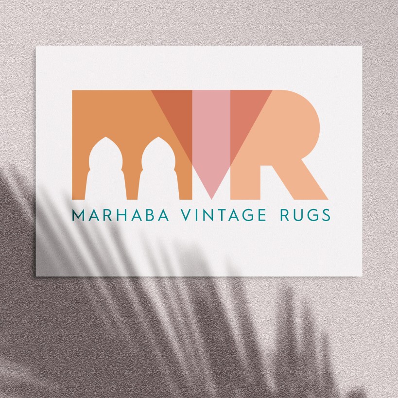
The logo is one of my favorites so far, and I know it will set her on the path to success with her new business!