Jessie & Jack’s Wedding Invitations

Usually when I’m designing for a client, I create a few options that are exactly what they’ve asked for, and one or two that are what I would do if given carte blanche to finish the project however I wanted. Every once in a while the client chooses my preferred design—this is one of those cases!

jessie_jack_invites_8892

I love the ethereal watercolor background, the reverse over-sized script paired with simple all-caps typography, and that we incorporated the venue sketch from their save the dates to tie the stationery suite together. They are my perfect invite!

An Extra Special Watercolor Wedding Map

lucie_curtis_map_8931

Lucia and Curtis had purchased their wedding invitations from a popular website, but wanted to add a custom map to encourage their guests to explore some of their favorite places during their wedding weekend. I worked with the groom’s mom to create this special piece, featuring hand-painted watercolor illustrations of the wedding venue, his hometown and some of the spectacular natural features of the area. It is above and beyond any of the maps I’ve designed previously, but I think it was well worth the effort!

Brittani & Peter’s Rustic Montana Wedding

brittani_2998

Brittani and Peter got married today in rural Montana and I could not be more excited to share their invitations! Inspired by a previous custom project of mine, Brittani and I incorporated details specific to the couple to create a suite that truly represented them and their big day.

brittani_details_2998

My favorite details are the unique watercolor touches, especially on the reverse of the main invitation card (it’s the first thing guests will see when they take them out of the envelope) and the RSVP. How great is that cow?!

Allison & John’s Romantic Floral Wedding Invitations

It’s finally the big day—the one I’ve been waiting for all year. Today is the day I get to share my first wedding of 2017!

Allison and John got married today in a romantic ceremony in a beautiful church in downtown Madison, followed by an elegant and fun reception at a very cool converted warehouse space just outside the city.

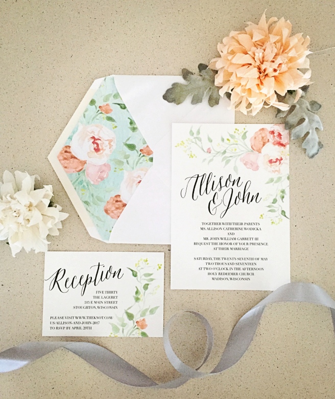
I’ve been working with Allison on details for her big day for almost a year now—you may remember her gorgeous floral save the dates from last fall. Being the dream client that she is, she wanted all her paper goods to coordinate perfectly, so I carried the romantic watercolor florals and classic-yet-casual calligraphy throughout the suite and added a truly special touch with a custom liner.

A few months before the big day, one of Allison’s bridesmaids got in touch to ask if I would design coordinating tote bags for the bachelorette party—which I happily did! Such a thoughtful way for all the girls to remember a great day!

I just love the map of local food sources on the back of their mouthwatering menu!

As a parting gift, the couple offered seed packets to their guests featuring a stamped illustration I designed. 

As you can see, Allison went above and beyond to make her day special from start to finish—and most importantly, at the end of the day, she got to go home with her best friend, who is now her husband. Here’s wishing you two all the luck in the world and a love that continues to grow. Thanks for making me a small part of your big day!

Pocket of Posies’ Business Cards

Last year, a pair California floral shop owners got in touch about business cards. After only a few emails back and forth, I realized they were pretty much my ideal clients—quick and decisive with feedback, open to new ideas, and maybe most importantly, they seemed to truly understand and value the work that goes into letterpress printing. Plus, they were interested in incorporating my new watercolor illustration services into their cards!

Pocket_of_Posies_6470

The result were these gorgeous bespoke cards. They were about as artisanal as you can get in an edition of several hundred: Hand-printed on an antique letterpress, hand-trimmed, and each hand-painted with a unique watercolor flower.

This year when they got in touch for a reprint, they were looking for a slightly lower cost product, so we decided to merge commercial printing with my letterpress work. Since the design on the back of the cards didn’t create a significant impression into the paper, I would have that side printed commercially, while letterpress printing the front. We decided to bring costs down even more by also commercially printing the flowers on the front, which of course isn’t as beautiful and unique as the original hand-painted work, but as a small business owner, I get it! And, since I print business cards four at a time, I was still able to incorporate different painted flowers to imbue the cards with some variation. Overall, I think they turned out great and I’m thrilled to be able to offer hybrid services to future clients!

POP_businesscards_0793